Ørsted - QC Viewer - Wind Turbine Loads Analysis Tool
I redesigned QC Viewer features, turning a technical, developer-built tool into a clear and reliable workspace where engineers can find, match, and verify turbine data with confidence.
Result Highlights:
-
60 – 70% faster sensor discovery with the new filter flow
-
Reduced manual effort through automated name-based matching
-
Higher confidence in validated datasets used for turbine analysis
-
Scalable design pattern adopted across Ørsted’s engineering tools

1. Project Context
Why It Matters to Ørsted?
QC Viewer is a quality-control application used by Ørsted’s loads engineers to inspect and validate raw wind-turbine sensor data before analysis and design decisions.
Each wind turbine contains hundreds of sensors that measure wind speed, pressure, and blade load. Before engineers can use that data for simulations or reporting, they need to check for missing, duplicated, or incorrect readings. That’s where QC Viewer comes in, it acts as the first validation gate to ensure data accuracy and trustworthiness.
As Ørsted expands its offshore and onshore wind-farm portfolio, data quality becomes a safety and efficiency priority. If sensor data is incomplete or mislabeled, it can affect turbine performance modelling and maintenance scheduling.
My work on QC Viewer directly supports Ørsted’s Data Ecosystem strategy which is enabling engineers to work confidently with trusted, validated data across systems. The goal was to make this technical tool clearer, faster, and more reliable, while aligning with the broader vision of accessible, high-quality data for sustainable energy innovation.
My role & team
-
UX Lead
-
With Product Owner, Engineer Developer, Developers
-
Duration: 9 months
-
Scope: Discovery, Filter enhancement & Name-based matching
2. The Challenge
Why UX Was Brought In
QC Viewer was originally developed by Ørsted’s engineering team as a functional internal tool. Designed to process large sets of turbine data quickly, not necessarily to be user-friendly.
Over time, the application became essential but difficult to use. Engineers relied on it daily, yet many struggled with its interface and logic.
Through early conversations with the product owner and engineers, several pain points became clear:
-
Finding data was slow and inconsistent. The filter system didn’t match how engineers think about turbines and sensors.
-
Cross-checking datasets was error-prone. Naming conventions differed between sources, forcing engineers to match items manually.
-
No clear feedback or visual cues. Users often weren’t sure if their filters were applied correctly or if results were complete.
These issues led to lost time, duplicate work, and uncertainty in the analysis phase All of which increased risk for the engineering teams relying on accurate data.
Recognizing this, the product owner invited UX to help redesign QC Viewer for clarity and trust. The goal wasn’t cosmetic but it was to enable engineers to make faster, more confident decisions based on validated data.
“We know the tool works, but it only works for those who built it.”
- Loads Engineer, Offshore Team


3. Research & Discovery
Understanding the Real Pain
When I joined the initiative, no user data or analytics existed for QC Viewer. The application had evolved organically from engineering needs, so its structure reflected developer logic more than user workflows.
To ground design decisions in evidence, I led a qualitative research round with engineers across offshore and onshore wind projects. Focusing on how they use QC Viewer in real scenarios.
Research Goals
-
Understand engineers’ workflows from data import to validation.
-
Identify where confusion, delay, or rework commonly occurred.
-
Capture mental models around “quality checking” and dataset trust.
Methods
-
Semi-structured interviews with loads specialists & metocean engineers
-
Walkthrough sessions where users demonstrated their actual QC steps.
-
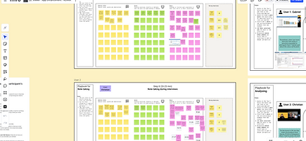
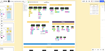
Affinity mapping and clustering to identify common friction points.
What We Discovered
Despite different backgrounds, engineers shared similar frustrations:
-
Findability: Filters didn’t match their domain hierarchy (farm > turbine > sensor).
-
Confidence: Users weren’t sure if filters or matches produced complete results.
-
Efficiency: Cross-comparing datasets meant downloading files and manually checking names.
-
Trust: Users questioned whether the tool’s output could be relied on for critical reports.
These findings revealed that the problem wasn’t just interface complexity, it was a mismatch between system logic and user mental models.
By mapping these pain points into journey and experience maps, I highlighted where design improvements would have the greatest operational impact.

4. Defining the Backlog
Turning Insights into Action
After completing research synthesis, I facilitated a prioritization workshop with the product owner, engineering developer, and developers.
Our goal: translate qualitative insights into a clear, shared backlog that everyone could rally around.
Workshop Approach
I visualized key findings on a Miro board, then guided the team to group potential improvements by impact vs. effort.
Each idea was discussed not just in terms of desirability, but how directly it contributed to the engineering ART’s OKR:
“Improve data validation efficiency for turbine loads analysis.”
What We Prioritized
From over a dozen improvement ideas, we aligned on two focus areas that addressed the highest user pain and business value:
-
Filter Redesign - streamline how engineers search and segment datasets.
-
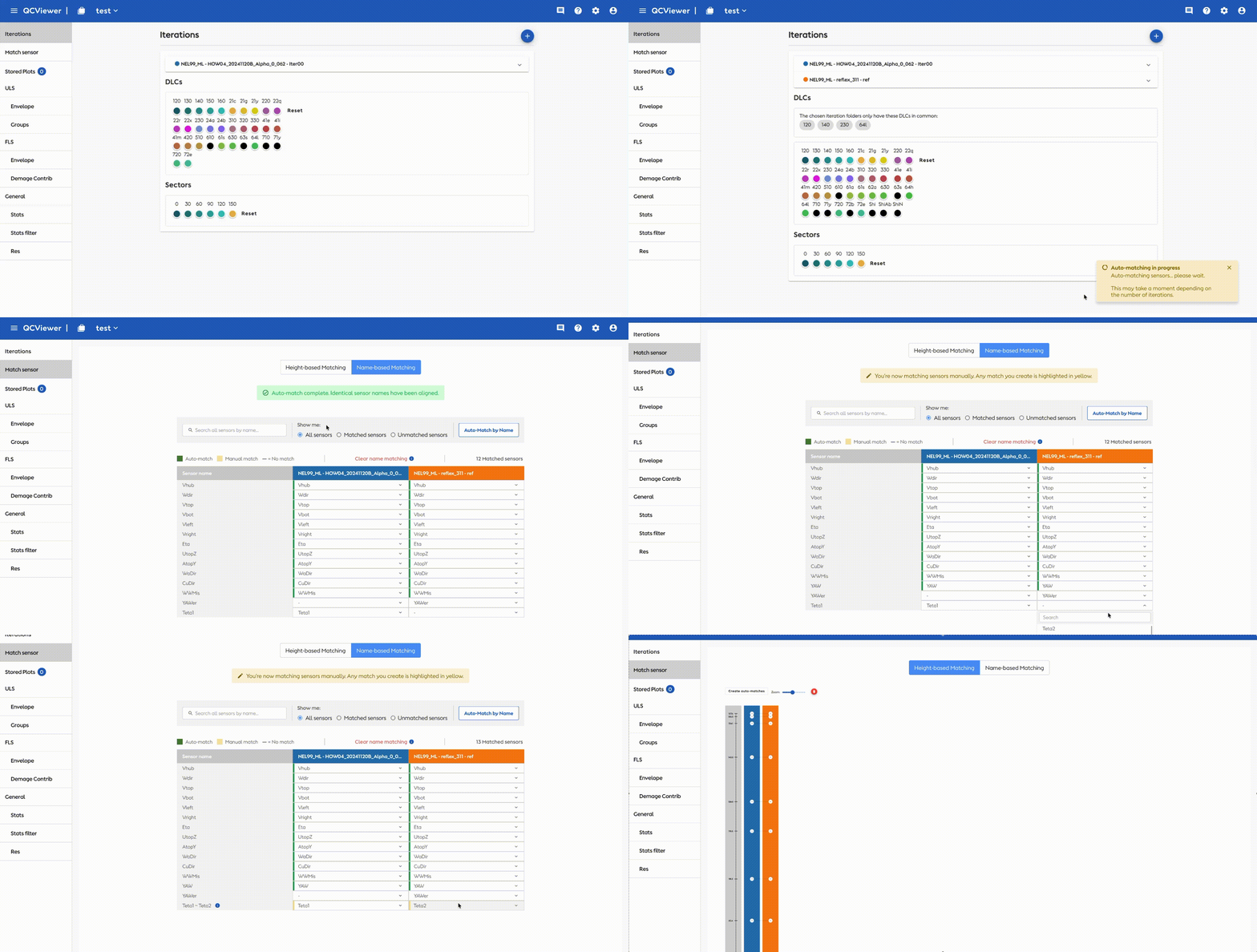
Name-Based Matching - simplify and partially automate sensor comparison between datasets.
Secondary opportunities such as info box enhancement, improve the stored plot organization and enhance plot interactivity, comparison tools, and visual clarity for better analysis and presentation were placed in the “Next Iteration” column to maintain focus and deliver measurable wins first.
Outcome
The prioritized backlog not only gave the development team clarity, but also positioned UX as a strategic decision partner in ensuring that improvements mapped directly to team OKRs and Ørsted’s broader Data Ecosystem goal of trusted, reusable engineering data.


Feature Focus #1
Filter Redesign
Making complex data filtering effortless and reliable
Problem
Engineers relied on filters to narrow down massive turbine datasets but the original filter design was nested, inconsistent, and counterintuitive.
There was no clear hierarchy, so users often didn’t know whether they were filtering by turbine, sensor, or time range. Some even exported data to Excel for manual filtering, creating unnecessary steps and potential errors.
“I don’t trust that the filter is showing me everything I need.”
- Loads Engineer, Onshore Team

Definition of Success
We defined success based on whether engineers could confidently and efficiently narrow down large datasets without leaving the tool.
Key success indicators included:
-
Reduction in time taken to locate target sensors
-
Increased confidence that applied filters reflect the intended dataset
-
Ability to combine and adjust filters without losing context
Design Goals
-
Reflect how engineers actually think about their data (farm > turbine > sensor).
-
Allow flexible, combinable filtering without refreshing or losing context.
-
Provide instant visual feedback to confirm what’s being viewed.
Solution
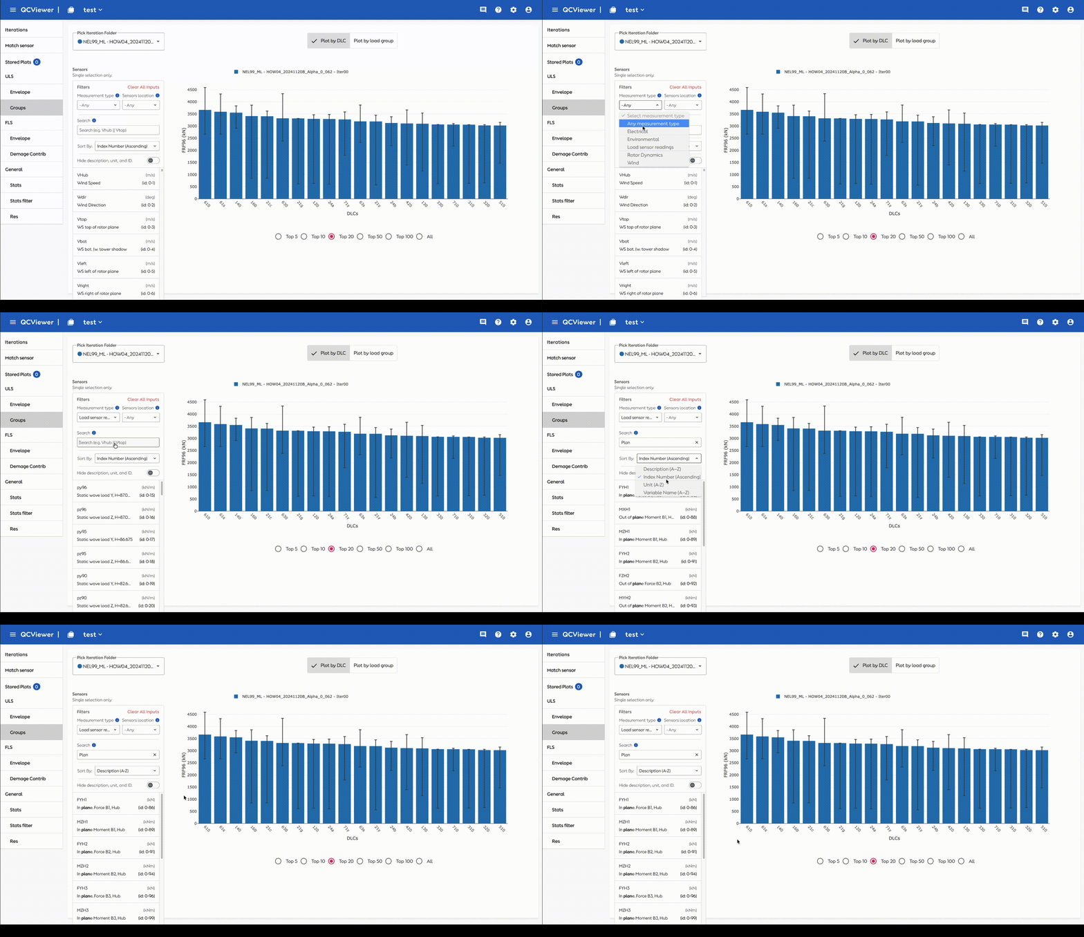
I redesigned the filter into a clear left-panel layout with structured, progressive options that follow engineers’ mental hierarchy from measurement type to sensor location.
Each active filter now appears inline as search chips with a one-click “clear all” option, reducing confusion and supporting quick iteration.
Technical variable names were paired with plain labels and units, helping engineers quickly identify what they’re filtering without guessing codes.
The redesign also introduced subtle interaction feedback, a brief loading animation and confirmation state to reassure users that filters had been applied correctly.

Development & Testing Status
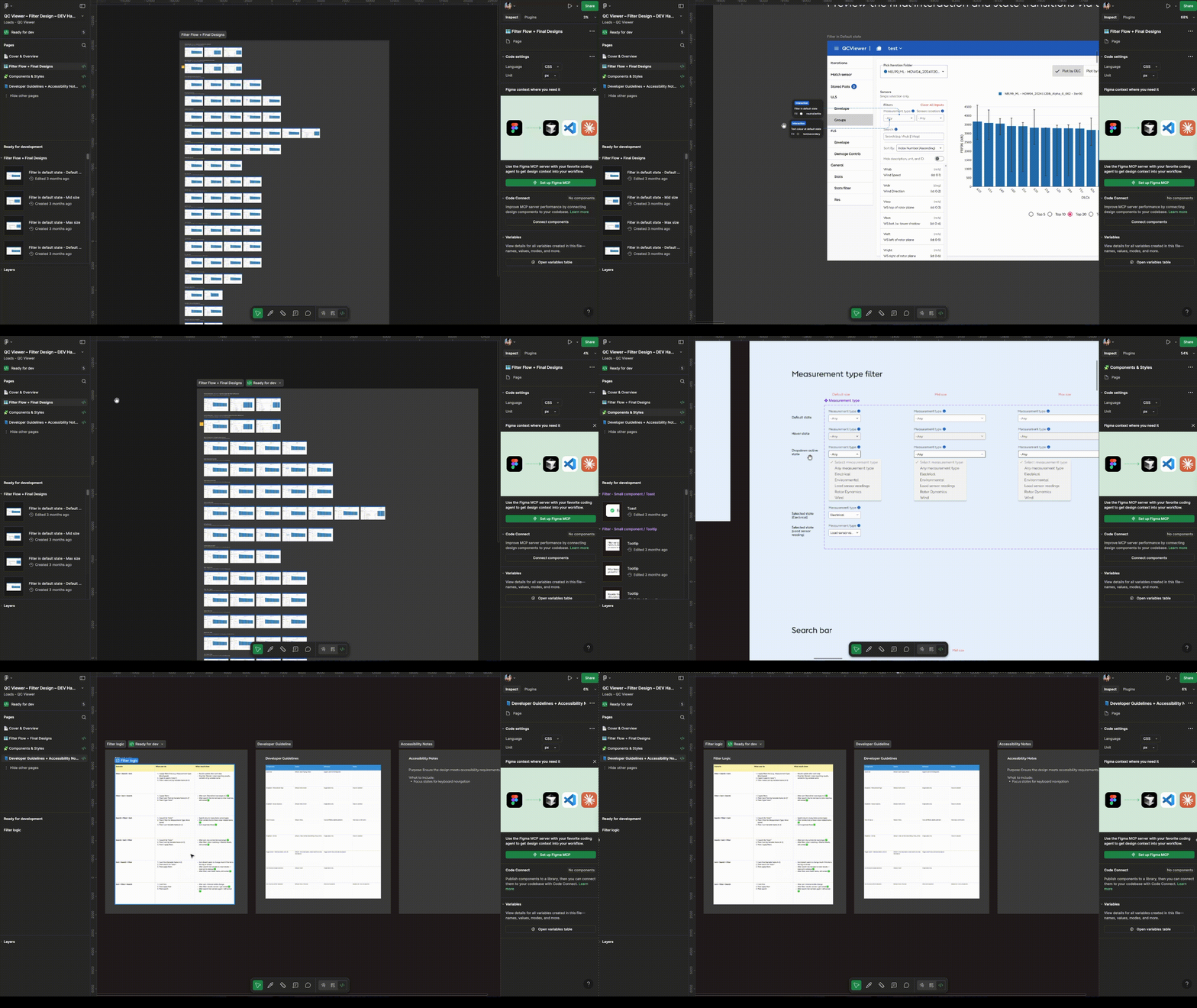
Currently under development. I collaborated closely with Front-End engineers, preparing detailed handover documents outlining filter logic and interaction behaviors.
Impact
-
Faster data discovery: Engineers located target sensors 60 - 70% faster in users testing.
-
Higher confidence: Users reported feeling “in control” of what they were viewing.
-
Scalable pattern: The filter logic later became a reusable design component for other tools in the Ørsted Data Ecosystem.
This redesign turned a high-friction task into an intuitive experience, enabling engineers to focus on insights rather than interface puzzles.
FYI, it is currently being developed. Early usability testing with a small user group (~15 engineers) showed promising improvements in findability and reduced time spent searching for sensors. We expect similar patterns once the feature is fully rolled out.


6. Impact & Reflection
Beyond the Interface
The QC Viewer redesign went beyond usability improvements. It reshaped how engineers interact with their data, turning what used to be a complex, developer-oriented tool into a trusted daily companion for quality validation.
Tangible Outcomes
-
Increased efficiency: Engineers completed validation tasks significantly faster, reducing repetitive manual work.
-
Improved accuracy and trust: Clear feedback and guided matching reduced uncertainty around data integrity.
-
Reusable design patterns: The new filter and matching models became references for future internal tools within Ørsted’s Data Ecosystem.
-
Stronger collaboration: The success of this initiative encouraged more engineering teams to engage UX early in their projects.
Strategic Value
QC Viewer directly supports Ørsted’s Data Ecosystem and Quality-by-Design vision, ensuring that every dataset used for engineering analysis is accurate, validated, and ready for decision-making.
By improving how engineers find and trust their data, the tool contributes to Ørsted’s larger mission:
Accelerating sustainable energy through reliable, data-driven engineering.
Personal Reflection
This project reminded me that clarity is a form of empowerment.
Designing for engineers meant learning their logic, language, and trust signals and then translating that into a smooth, human-centered experience.
It also taught me the value of patience and curiosity. Coming from a non-engineering background, I had to take time to understand technical terminology and the deeper logic behind loads analysis. The engineering team was incredibly supportive, patiently answering my endless “why” and “how” questions throughout the journey.
While preparing the Name-Based Matching test, I learned the importance of validating visual cues and terminology clarity, especially for engineering users who interpret colours and labels differently depending on their domain tools.
Scheduling user testing was also a challenge; engineers are often managing critical deadlines and on-site responsibilities. It required persistence, flexibility, and empathy to find the right moments to involve them meaningfully.
Through this experience, I learned that collaboration and trust grow not from speed, but from mutual respect and shared understanding.
Even small interaction improvements can have a profound effect when your users are designing the systems that power renewable energy worldwide.
“Designing for precision is designing for trust, and understanding takes time.”
Project Information
Credits
Design Tools
PRODUCT & DELIVERY / ENGINEERING SPECIALIST
Figma & Miro
Alberto
DEVELOPMENT
Simon & Ze Loong
