AirAsia RedTix – Building a Design System
Creating a unified design language that improved speed, consistency, and collaboration across RedTix’s growing digital ecosystem.
Result Highlights
-
100 % UI consistency across projects
-
2× faster design-to-development handoff
-
Shared design–dev vocabulary through Figma and tokens
-
Foundation for future scalability (website + app)

1. Overview
About RedTix
AirAsia RedTix is the airline’s event-ticketing arm, powering major events across Asia and Australia – from Ultra Singapore to the Rugby World Cup.
Context
As RedTix’s products expanded, design files became inconsistent: dozens of button styles, mismatched icons, and differing typography. Each designer worked in isolation, making collaboration and iteration slow.
Goal
To build a centralized, scalable design system that would:
-
Create a consistent and trustworthy brand experience
-
Improve efficiency between design and development
-
Provide a solid foundation for future feature and product growth
My role & team
-
Design Manager
-
Research, System planning, Component architecture, Documentation, Testing with design & dev teams
-
Timeline: 3 months (2020)
2. Why It Mattered
Without a shared system, every new feature meant starting from scratch. Small UI inconsistencies led to big alignment issues and wasted time.
By building a design system, we aimed to:
-
Strengthen brand trust through consistent visuals
-
Empower designers to move faster with reusable components
-
Enable developers to code confidently with clear specifications
3. Where I Started
Research & Benchmarking
I began by studying design systems from industry leaders like Google, Apple, Airbnb, Spotify, IBM, and reading key resources like Atomic Design (Brad Frost) and Figma & Design Thinking by Tammy Taabassum.
Component Audit
Since I managed the design assets at RedTix, I gathered every existing element, like buttons, icons, cards, and modals, and created a complete visual inventory.
Insights
Comparing components side by side revealed the problem clearly: multiple button styles, inconsistent font weights, and single-use icons everywhere.


4. Planning the System
I adopted Atomic Design principles to structure the library:
-
Atoms: colors, typography, spacing, elevation
-
Molecules: buttons, inputs, cards, modals
-
Organisms: forms, navigation, tables
To stay organized, I duplicated Mohsen Hosseinian’s Figma Design System Checklist to ensure no detail was missed.
I also defined naming conventions and a simple update-approval process, so future designers could contribute without duplicating work.

Graphic by Brad Frost


5. Design & Testing
Designing the System
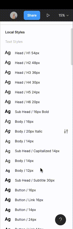
The system started with brand foundations (logo usage, color, type) and grew into functional UI components. Each part was designed, documented, and nested following the hierarchy.


Testing with Designers
Once ready, I invited the team to rebuild a sample page using only master components. Their feedback helped validate usability and coverage before finalising.
Developer Handoff
Together with front-end engineers, we prepared to translate components into design tokens using Figma API, allowing consistent use across web and mobile.
6. Outcome & Impact
-
Reduced design inconsistencies across RedTix products
-
Improved team efficiency and developer confidence
-
Created a clear, reusable foundation for future work
-
Accelerated design-to-development handoff
Reflection
Building a design system solo was challenging, but it taught me the power of structure and documentation.
The most valuable lessons:
-
Read deeply - understanding other systems clarified my own decisions.
-
Plan and checklist everything - structure keeps complexity manageable.
7. Takeaway
A design system is more than a library; it’s a shared language.
For RedTix, it transformed design chaos into clarity and set the stage for consistent, scalable digital experiences.
